
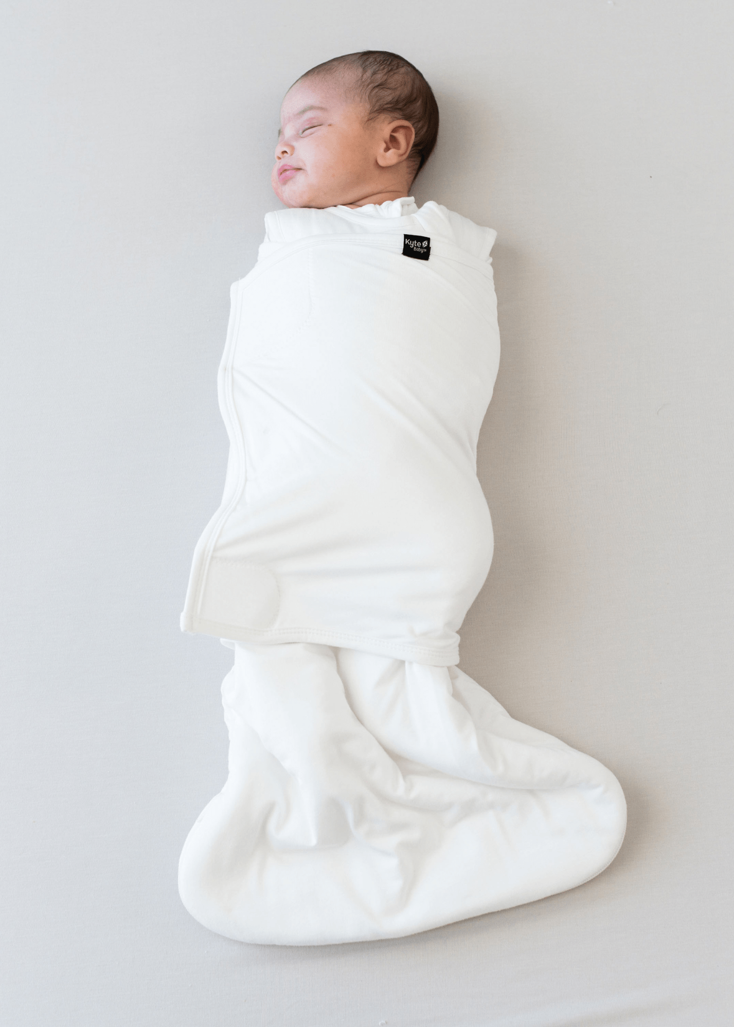

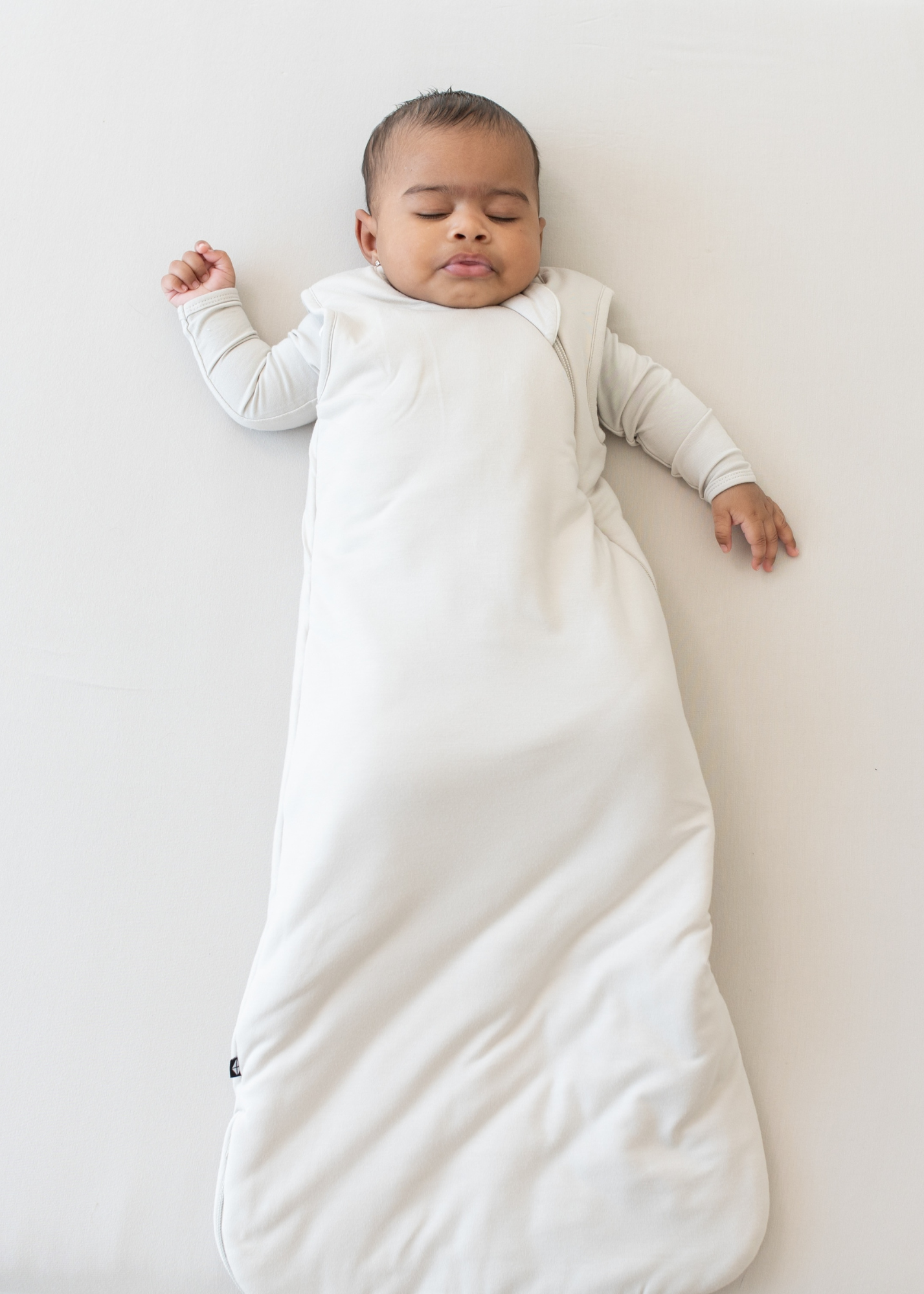


It’s almost leaf-peeping season, and there’s nothing better than witnessing the magnificence of autumn colors on the New England coast. The crisp air, fiery foliage, and white-sand coastlines of the area are exactly why autumn is arguably the most magical time of year. Now, we’ve captured the colors and charm of this idyllic region to bring them to you. Inspired by this imagery, our 2025 fall solids are a palette of those warm, earthy shades that blanket New England throughout September, October, and November.

Meet Atlantic, a dark greyish teal. Like the deep blue water of a New England harbor, this shade of blue captures the dark and mysterious feel of the Atlantic Ocean.

-
Compared to Teal, Atlantic is much darker, moodier, and more muted. Teal is a lighter and brighter blue with higher saturation than Atlantic.
-
Compared to Loch, Atlantic is more muted. Although the two colors are similar in hue, Atlantic is more grey-toned and less bright.
-
Compared to Baltic, Atlantic is much more muted and grey-toned. Both Atlantic and Baltic lean more teal than true blue, Baltic is much more saturated.
-
Compared to Steel, Atlantic is cooler and is more teal. The two colors are both dusty and similar in tone, but Steel is a truer blue.

Meet Fir, a dark dusty olive. This fall-inspired shade is the dark, earthy color of evergreen trees standing steadfast with their green leaves throughout autumn.

-
Compared to Evergreen, Fir is warmer and more olive in color. Evergreen has a bluer tint and is also more saturated.
-
Compared to Hunter, Fir is similar in hue but much darker and more muted. Hunter is a lighter olive, while Fir is more dusty and moody.
-
Compared to Pine, Fir is far darker and warmer in color. Pine is cooler in color, with a slightly blue hue.
-
Compared to Emerald, Fir is much darker and more muted. Emerald is a more saturated dark teal, while Fir is a very deep olive green.

Meet Bisque, a dusty beige. This light neutral is warm and comforting, resembling the color of the sandy coastlines of the East Coast.

-
Compared to Oat, Bisque is much warmer and more saturated. While Oat is a greyish neutral, Bisque is a beige neutral.
-
Compared to Almond, Bisque is slightly lighter and brighter. Almond is a little more muted, but the two colors are similar in hue.
-
Compared to Khaki, Bisque is brighter and slightly warmer. Khaki is more grey in tone.

Meet Latte, a tawny brown. This warm shade of brown is as inviting as a hot cup of coffee on a crisp autumn morning.

-
Compared to Spice, Latte is a little more muted and cooler in hue. Spice is more reddish than Latte.
-
Compared to Apricot, Latte is much cooler in hue and much more muted. Apricot is a true dusty orange, while Latte is more of a warm brown.
-
Compared to Sienna, Latte is much cooler in hue and much more neutral. Sienna is a rusty orange, while Latte is browner and more muted.

Meet Burgundy, a deep wine red. This shade resembles the reds of changing autumn leaves, and is a quintessential fall color.

-
Compared to Scarlet, Burgundy is darker and more muted. Scarlet is a rusty red, while Burgundy has more of a violet hue.
-
Compared to Ruby, Burgundy is darker and is more violet in hue. Ruby is a true dark red.
-
Compared to Cardinal, Burgundy is much darker, more muted, and has more of a violet hue. Cardinal is a bright, bold red, while Burgundy looks much moodier and less saturated.

Meet Espresso, a dark ash brown. Like the woody colors of tree branches and tree trunks, this shade of brown is dark, earthy, and comforting.

-
Compared to Coffee, Espresso is much darker and moodier. Although the two colors are similar in hue, Coffee is far lighter.
-
Compared to Nutmeg, Espresso is much darker and cooler in hue. Nutmeg is more of a warm, golden brown, while Espresso is a very deep, earthy brown.
-
Compared to Cocoa, Espresso is much darker and redder in hue. Cocoa is a purple-brown, while Espresso is a true dark brown.