


There’s no denying that there’s magic in springtime. Considered by many to be the loveliest months of the year, spring is the season of rebirth and renewal. Winter scenery thaws into green pastures, blooming florals, and the return of birdsong. Warmer weather and longer days beckon you to spend more time outdoors, answer the call, step into your garden, and enjoy the beauty of Mother Nature.
Our 2026 spring solids are inspired by the freshness of springtime, the feeling of tending your garden under the sun’s warm rays with a light breeze dancing across your skin. A palette of cheerful pastels, this collection captures everything there is to love about this season. Here’s how these spring solids compare to similar shades from our catalog.
Meet Basil, a light warm green inspired by the glossy, aromatic leaves of the basil plant.

-
Compared to Pistachio, Basil is more cool-toned. Pistachio is slightly warmer with more yellow, while Basil leans more toward a minty green.
-
Compared to Wasabi, Basil is warmer with more yellow. Wasabi is a cool green, while Basil is more of a yellow green.
-
Compared to Aloe, Basil is brighter and more saturated. Aloe is very pale and a little dusty, while Basil is greener.
-
Compared to Matcha, Basil is lighter and warmer. Matcha is more cool-toned than Basil.
Meet Thistle, a pinkish lilac inspired by the soft color of purple thistle.

-
Compared to Wisteria, Thistle is brighter and pinker in hue.
-
Compared to Lilac, Thistle is much more pink in hue. Lilac is cooler-toned with more blue, while Thistle is warmer.
-
Compared to Mauve, Thistle is quite similar in hue, but overall lighter and brighter.
-
Compared to Taro, Thistle is lighter and pinker in hue. Taro is more of a true purple, while Thistle leans closer to pink.
Meet Chamomile, a muted pastel yellow inspired by the yellow centers of delicate chamomile flowers.

-
Compared to Lilikoi, Chamomile is lighter and less saturated. Lilikoi is a sunny yellow, while Chamomile is more pastel and very light.
-
Compared to Daffodil, Chamomile is lighter and less saturated. Daffodil is a true yellow, while Chamomile is a very pale, slightly dusty yellow.
-
Compared to Wheat, Chamomile is a brighter yellow. Wheat is a dusty, muted yellow, while Chamomile is more saturated.
-
Compared to Honey, Chamomile is much lighter and cooler-toned. Honey is a very warm yellow that is closer to gold.
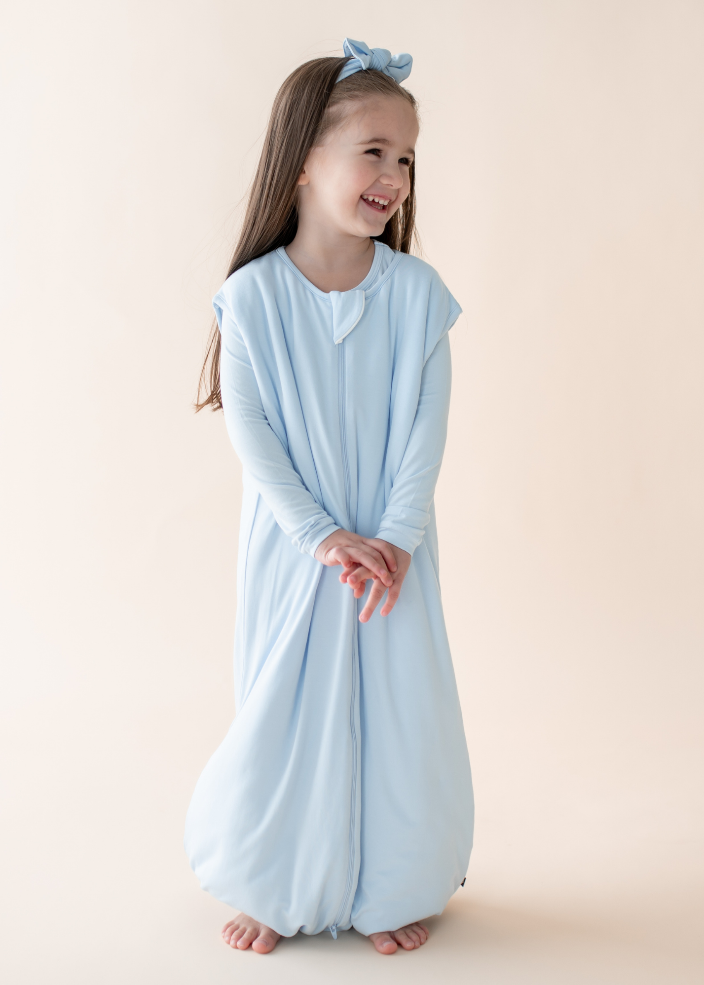
Meet Breeze, a sky blue inspired by the gentle caress of a breeze on a sunny spring day.

-
Compared to Powder, Breeze is slightly darker. The two colors are similar, but Powder is brighter and lighter than Breeze.
-
Compared to Mist, Breeze is slightly more saturated and bright. The two colors are similar in hue, but Mist is slightly warmer than Breeze.
-
Compared to Stream, Breeze is lighter and less saturated. Stream is a true baby blue, while Breeze is a true sky blue.
-
Compared to Glacier, Breeze is lighter and brighter. Glacier is more grey in tone to create a slightly dusty blue, while Breeze is much brighter.