


Ah, spring. The season of rebirth and renewal. The time of the year when the outdoors comes alive with the colors of blooming flowers, the music of birdsong, and the sounds of nature waking to warmer weather.
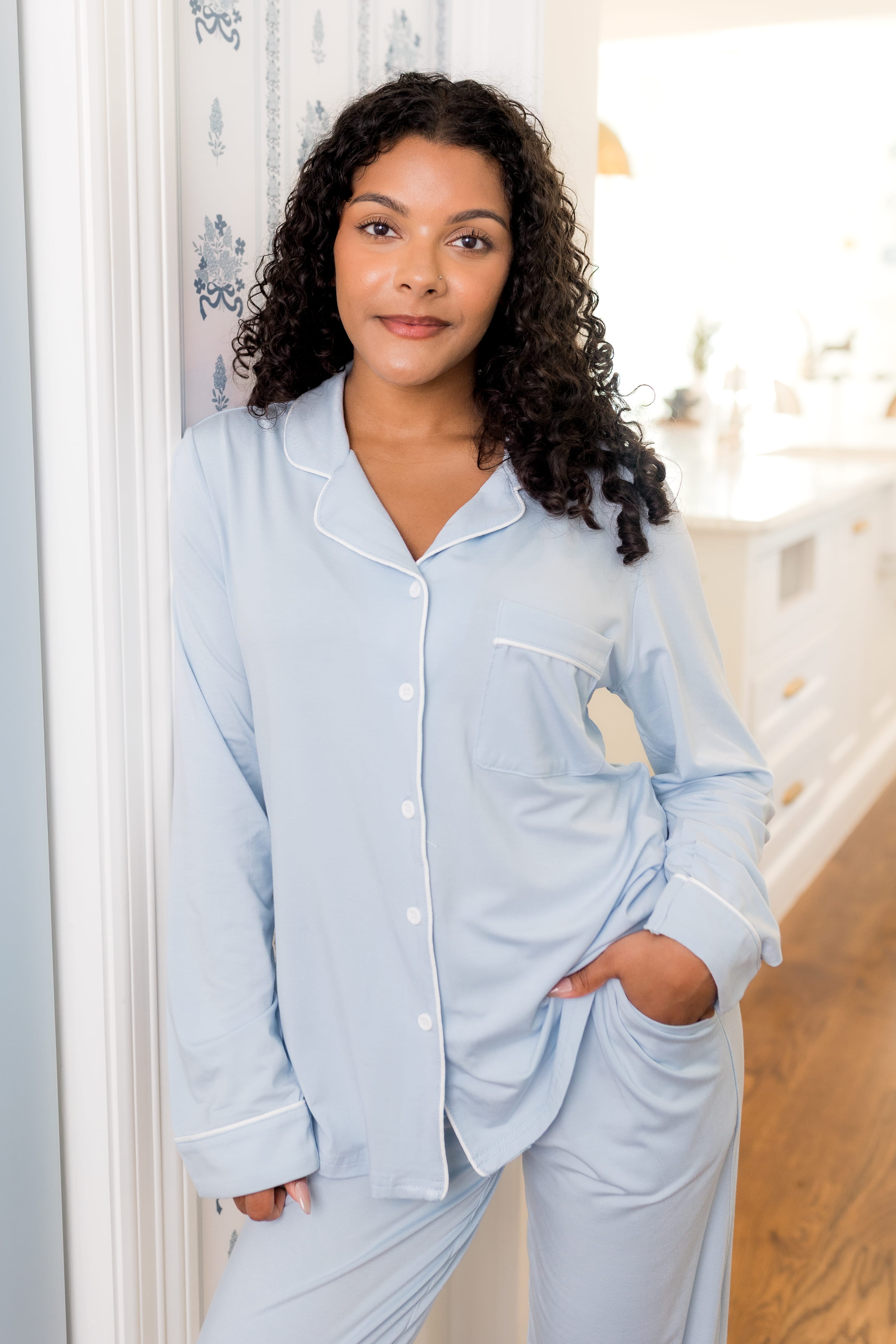
In keeping with the themes of the upcoming months, we can’t think of a better way to wave goodbye to winter than to introduce a brand new collection of colors! Meet our spring solids, a palette of warm, joyful colors inspired by the tones of the season. To get a better idea of what these new hues look and feel like, we’re comparing them to their sister shades (some of which are still available on our website, while others are retired).
Soft Pink Pastel Baby Clothing in Crepe
Meet Crepe, a soft pastel pink with warm tones. This light pink is the perfect rosy shade for spring, bringing to mind blooming flowers.

How does Crepe compare with Blush, Petal, Peony, and Rose?

- Compared to pale Blush, Crepe is much more saturated and vibrant.
- While Crepe and Petal are similar colors, Crepe is lighter and slightly more cool-toned.
- While Peony is cool-toned with bluish hues, Crepe is a warmer pink with more yellow in it.
- Crepe is far less saturated than Rose, which is similar in tone, but vibrant and bolder.
Robin Blue Kids Clothing
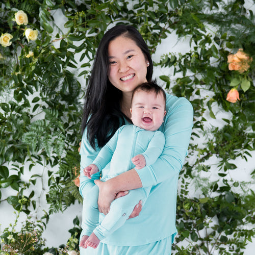
Meet Robin, a light aqua blue. This vibrant cyan shade is just as pretty as a robin’s egg, for which it was named.

How does Robin compare with Sea Mist, Powder, Jade, and Seafoam?

- Robin has far more blue than Sea Mist, which is a light sea green tinged with blue.
- Robin is a true aqua blue, while Powder is a light ice blue color.
- Although Robin and Jade are very similar and vibrant, Robin is more blue-toned, while Jade is more green-toned.
- Robin is much more vibrant than Seafoam, which is a more muted blue-grey with green tones.
Softest Pistachio Green Baby Clothes
Meet Pistachio, a soft yellow-green that’s easy on the eyes. This milky green color is the perfect balance between cool and warm tones, and feels as fresh as springtime.

How does Pistachio compare with Kiwi, Grass, Aloe, and Sage?

- Although both colors are light greens, Pistachio is much more cool-toned than Kiwi, which has far more yellow in it.
- Compared to Grass, which is a vibrant yellow-green, Pistachio is much lighter, more muted, and cooler-toned.
- Aloe is the palest shade of grey-green, while Pistachio is more vibrant and colorful.
- Sage is a muted and pale grey-green with blue tones while Pistachio is warmer, greener, and more vibrant.
Bright Butter Yellow Baby Outfits
Meet Butter, a light golden yellow that feels as warm and fresh as sunshine. This creamy and vibrant shade is the joyful yellow of the season.

How does Butter compare with Daffodil, Pineapple, Honey, and Marigold?

- Butter is more saturated than Daffodil, which is a pale, milky yellow.
- Although Butter and Pineapple are very similar, Butter is a little lighter, while Pineapple is more sunny and saturated.
- Butter is more of a true yellow than Honey, which is a little more muted and slightly more peach-toned.
- Butter is much lighter and brighter than Marigold, which is a far deeper shade of gold.
Snuggly Periwinkle Blue Bamboo Clothes
Meet Periwinkle, a dark pastel blue tinged with violet. This gorgeous color is vibrant and eye-catching, with the slightest touch of purple to make it really stand out among other blues.

How does Periwinkle compare with Sky, Slate, Steel, and Indigo?

- Sky is a truer blue than Periwinkle, which is tinged with violet and more vibrant in color.
- Periwinkle is more bright and vibrant than Slate, which is a muted blue-grey.
- Steel is a darker blue-grey and more muted than Periwinkle, which is a bright blue with a slightly violet hue.
- Although both Periwinkle and Indigo have a slight purple hue, Indigo is far darker and more vibrant than Periwinkle, which is a more pastel shade.
Our spring solids will brighten your day and your wardrobe. Enjoy matching spring outfits with your family during this season of renewal.